If you're anything like me, you know about your presentations weeks in advance. But that doesn't stop you from waiting until the last minute to put your thoughts and slides together, does it? So it's no surprise that your PowerPoint slides don't deliver the oomph that you're looking for. People smile, but you can tell, even as you're presenting, that your slides haven't helped you. In some cases, if your deck really sucks, they've distracted people – and that's never what you want. Well today I want to share with you 5 simple questions you can ask yourself before you turn in or deliver any presentation. These questions will help make sure your PowerPoint doesn't suck!
Mistake #1: You trusted Microsoft
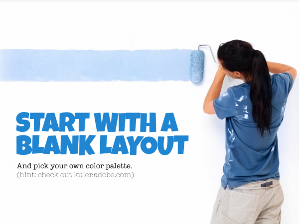
We're going to start where everyone makes their first mistake. Did you pick from the themes when the program started? Don't do it. Pick the plain white one. Start from scratch. Why? Because the default themes, layouts, and color palettes all suck! Did you catch that I said their layouts suck? What's a layout? It's that default structure that puts a title up top and bullet points in your body. Don't use it. Pick the “blank” layout and start from scratch.
I'm also a fan of picking your own color palette. But if you're not a designer, don't worry. Head over to Kuler (kuler.adobe.com) and check out all the color palettes there. They'll show you some good-looking stuff.
 Mistake #2: Too Much Text
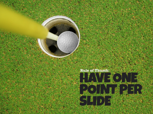
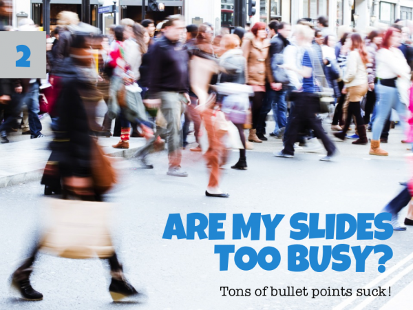
One of the reasons I tell people to start with a blank slide is because I know what happens when you pick the default layout. You end up with a blinking cursor just begging you to add more bullet points. So what do you do? You put too much text on each slide. And guess what? You know where I'm going, don't you. That sucks! PowerPoint's default layout is crap. So start clean and when you do, grab the text tool and drop it onto the blank canvas.
See how big my text is? By having text that big, it helps restrict my content on each slide down to one main point. Only one point. Not three. Not four. Just one. It also helps me view the images in the background (which should be strong ones that help you make your point – but I'm getting ahead of myself).
Mistake #3: Tiny Text
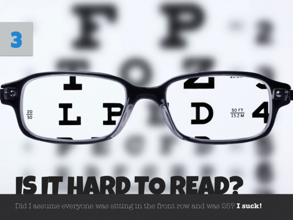
I know you're young and have great eyes. But guess what? Not everyone is like you. In fact, what if your audience is 10-20 years older than you and sitting 20-30 feet away? Do you think they can read your 16 px font? If you have type that small, it's because you're putting too much content on a single slide. If so, read the point above!
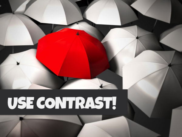
The other way to help make sure people can read your text is to make sure it stands out from the image behind it. So in this case, if I want you to be able to read the text, I can put a dark background behind it. This separates the text from the image and helps it stand out. My choice of color helps it pop even more. Contrast is your friend (in visuals & with text). Leverage it!
Mistake #4: Cheesy Clip Art & Images
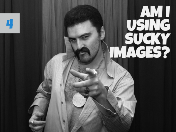
Everyone knows you can get clip art from Microsoft for free. You can even find images for free online. But be careful, just because google finds them doesn't make them free. But none of that matters if it's all horrible, right? Don't put an image on your slide just because someone told you that it would help. It only helps if the image is helpful. So be critical about where you source your images.
 I get many of my images from ShutterStock – and while it's expensive, I present enough that it's worth it. I only subscribe for one month and then I cancel and I don't go back from 6-8 months. So in the end, it's worth it. By knowing my audience I can know what will make them laugh, cry, or have any of the emotional responses I'm trying to elicit. That helps me go find the right image.
Mistake #5: No Hints of When You'll be Done
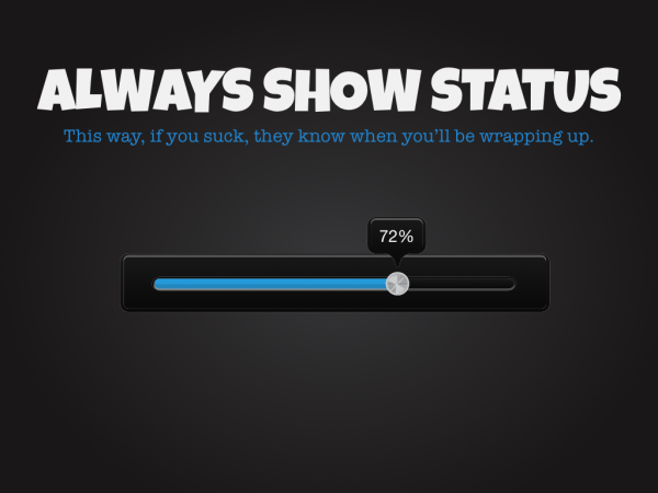
Let me tell you something your mom won't tell you. Sometimes it's not your PowerPoint that sucks. Sometimes it's you (and sometimes it's me). In those cases, you need a way for your audience to know when you'll be done. Or at least how far into your argument/case you are. That's why I said I had 5 questions. It's why on each question slide, I put a number. I'm basically saying, “hey, I may suck, but you only have 2 more questions left – so calm down and stay seated and try not to riot!”
So make sure you give visual cues, and I like using lists, to help people know exactly where you're at.
That's my List
Those are the five questions I ask before I ever wrap up a PowerPoint presentation. Did I miss something that you would add?

