Getting ready to create a presentation?
I have four presentations next week, and in a couple weeks I'm speaking another three or four times. It's that season where I'm doing a lot of speaking. And that means I'm spending a lot of time in PowerPoint.
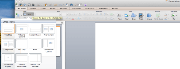
You and I both know we're not professional designers. But that doesn't mean you need to use the default layout that PowerPoint gives you. In fact, many people don't know you can change the layout to a blank canvas.
But you can, and you should. Because the default layout is a recipe for boredom and poor design. It's the reason most people hate PowerPoint. But you and I know better. We can create really powerful and effective slides if we don't use the default layout and follow three design tips that I've jotted down for you.
Three effective PowerPoint presentation design tips
I know, you're probably wondering if the “don't use the default layout” was one of the three tips. It's not – just count that as an extra bonus. But here are the three design tips that I've found have a significant impact on my slide design. They help me look much more professional. And when you're presenting after someone else, that's a big deal!
Tip one: Only have one point per slide
The default layout in PowerPoint often has you putting a title and three points underneath. And some people I know turn that area into four or five points. But here's the thing – people aren't computers. They're not memorizing your slides. If you want to have an impact, give each slide only one job to do.
You know you're going to spend some time on these points…so people will be staring at the screen for a long time while you sit there talking about multiple points. Instead, break it up. Use three slides instead of one. The other benefit is that you'll be able to use a much larger font size – so the people in the back can read your slides.
It's basic design philosophy but I often have to remind people that if the back row can't read your slides, the slides are worthless. So get crazy – use 80, 100 or even 120 point fonts. It's easy if there's only one point on your slide.
And there's another upside to this approach. When you only have one point on the slide, it's easier to pick great images.
Tip two: Use photos to your advantage
When I'm giving a talk, I know the moment I change my slides – regardless of what I'm saying – people will look up to the screen and look. They'll shut their brains off and just look – even if it's just for a second or two.
But in that second, I have an unfair advantage. Because I have all their attention. And I haven't said anything yet. And the data from my image is going to shoot straight back to their brains 60,000 times faster than any other data input. That's how fast and powerful image data is. Up to 50% of our brains are wired to process visuals.
So in that first second before I speak, but just after I change slides, I use a full screen image. A bleed. And the image makes the point – way before they hear any of my words.
But I don't have to have text on my slides. I don't even have to have images that are an exact match for my point. I just need an image that will emotionally resonate with my point. If I want to talk about dangers and risks of a particular course of action, a single image that “suggest” fear, or stress, will get my audience prepped for my point.
And in that moment, I win. I've used photos to my advantage.
Tip three: Create handouts
I know, beyond the fact that you think maybe I'm a bit manipulative, you're probably frustrated because you're thinking about all the content you want to share and how it won't fit on a single slide, or that there aren't images for what you're going to share. I get it. I hear those challenges every time I teach a class on presentations.
First, let me share with you something you need to know – 90% of what you share will be forgotten in 30 days. Most of it will actually be forgotten within 60 minutes of your presentation.
So my design tip is to keep all your great content off your slides. Create handouts instead. And use PowerPoint as an emotional billboard that helps you get your point across, rather than as a leave-behind reminder of your presentation. Handouts do that job well.
Conclusion
Everyone I know wants to be more effective when they present. No one wants to suck at presentations. So hopefully these three tips will help you. You can check out a sample of my slide decks here in my presentation area.

