
Do you have a pricing page that's converting?
I can't tell you exactly how long I've been working on pricing pages but you can't escape it if your career has been in product development and product management. At minimum it's been twenty years. And the worst thing you can experience is doing all the hard work to build a software product and then not see sales come in. You're left scratching your head. Is it the product? Or do I have a pricing page that isn't driving conversions?
The other day I was working with a plugin developer – looking at some WordPress products that had pricing pages that were working. And as I highlighted what I liked, I thought – I should share more of these best practices with everyone.
So let's get into why your pricing page may not be converting well.
Your pricing grid is too complex
The first problem is that your pricing grid may be too complex. In the end, the thing we all care about most when designing our pricing pages is that we don't create friction or unnecessary angst with prospects.
If you have 6, 8 or 10 plans, you're easily going to create analysis paralysis. But we know that. Most of us have been working on bringing it down to 2, 3 or 4 plans. That's good.
But it's not the only complexity that exists.
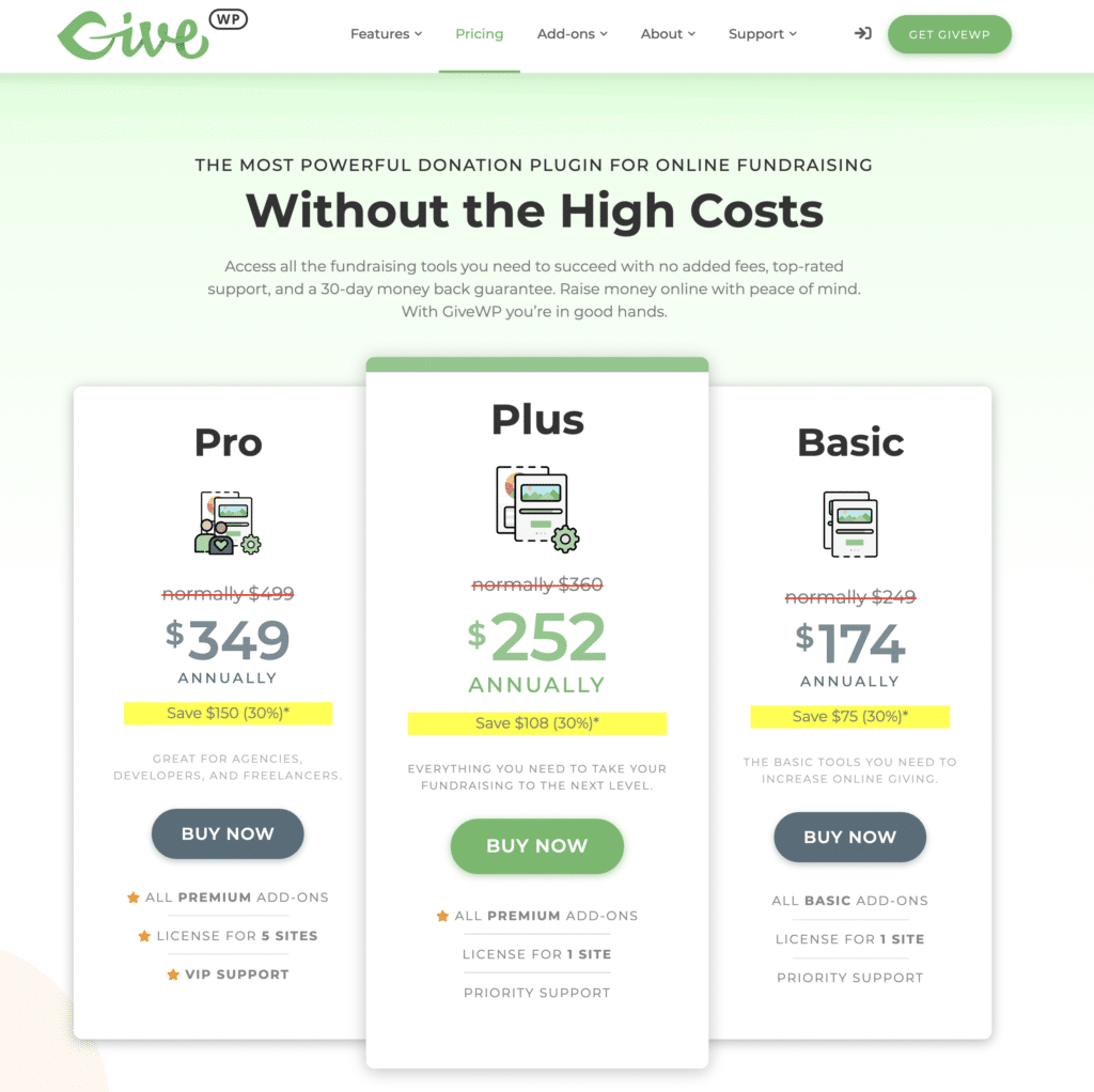
GiveWP recently re-worked their pricing page and it's gorgeous (which shouldn't shock any of us).
What I like about their new pricing page is that they have three plans, priced clearly and with large text, easy to read, and a limited amount of text below the “Buy Now” button that distinguishes them. No overwhelm.
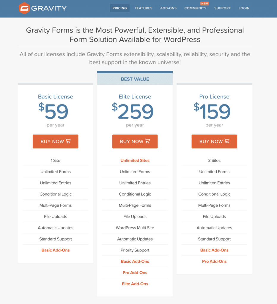
You know who else does this well? Gravity Forms. They too have 3 plans, large declaration of the price, and a clear way to see the difference between plans.
If you're pricing page has tons of plans, or a massive comparison grid, you might be experiencing challenges driving conversion.
Your pricing page requires expertise that doesn't exist
There's another challenge that a lot of product folks create for their prospects on pricing pages that we should talk about. It's about who is the expert.
You're the expert. Not your customer.
So if your customer has to become an expert in order to understand the nuances of your various features, because the naming of features is complicated – you're going to lose conversions.
If your pricing comparison grid is filled with terms that don't translate, or if I have to read what's included in each bundle and really do work to figure out which plan is for me, we're going to have trouble.
I want you to do the work for me.
Imagine buying a car stereo (which I recently did) and having to tell the guys at Best Buy which harness you need to buy to make it work with the car you have? That's insane!
I want them to tell me what I need, and what I don't need.
The easiest way to work on this is to invite folks outside of your team to read over your pricing page and see if they know which plan is right for them.
Note: I'm not talking about having “my mom” look at it. I'm saying, if you build an LMS plugin, or a gallery plugin, you better talk to a coach or photographer.
You're missing a risk eliminator
Let's go back to GiveWP for a second. They have a Zero Risk Money Back Guarantee. That's fantastic! It's big. It's clear. And it immediately tells their potential customers that they have nothing to worry about.
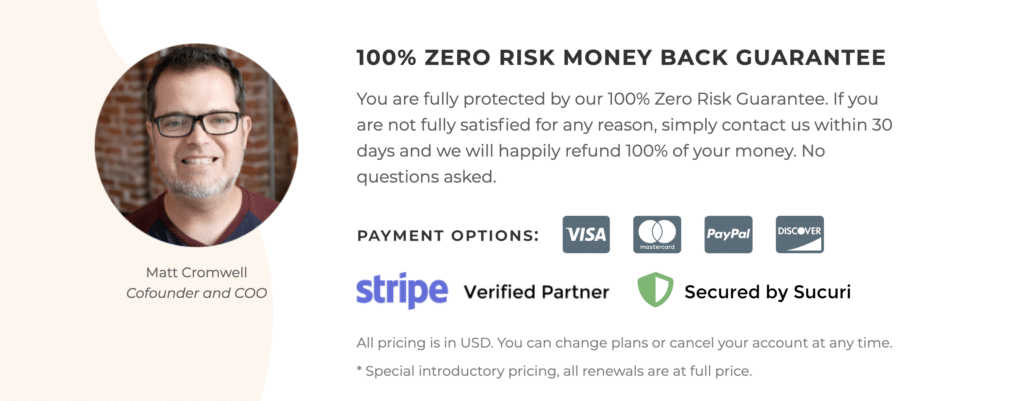
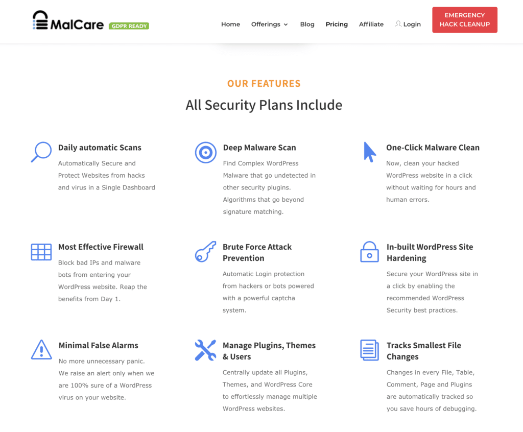
You know what they don't have, that would make it even better? Check out Malcare. The one thing I didn't see on GiveWP's pricing page was testimonials. But it's exactly what I do see on Malcare's site.
Every single thing you can do to eliminate risk – from testimonials to money back guarantees – will help drive conversions.
You're not answering the questions people have
Back to the GiveWP pricing page – they have, like many other plugin sites, a section that answers common pre-sales questions. It's awesome. But look at it closely for a second and see if you notice what I did right away….
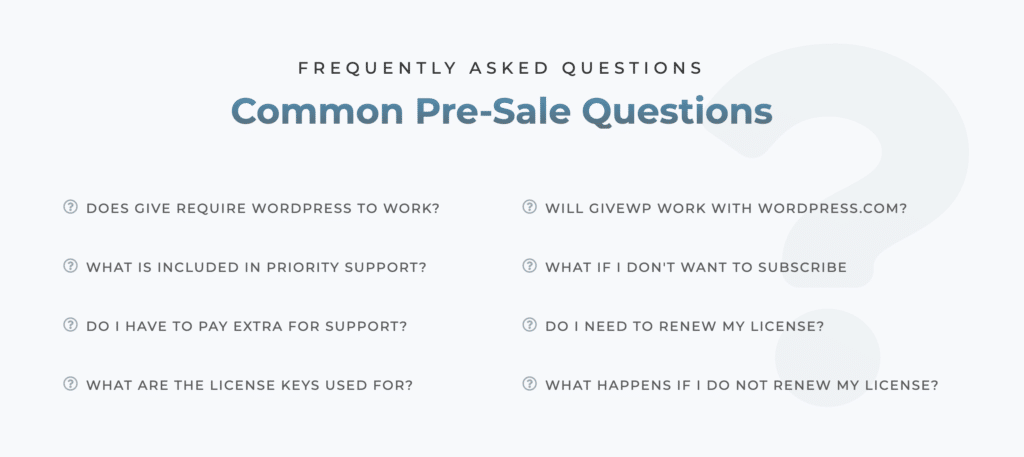
Unlike most of the FAQ sections on most sites, theirs has a lot of white space. I mean, they create room to let their text breathe. Most of the page builders have FAQ solutions, and Gutenberg blocks exist for this too, but they're bunched up tightly and hard to read.
Which brings us to the design of your comparison grid…
Your feature comparison is hard to read
Notice right away (and this is GiveWP again) that they have put attention to the design so that there's a lot of white space. It makes it easy to read. And here's the crazy thing – when things are hard to read, it suggests to people that the product will be hard to use. You can read the research results if you don't believe me!
That's why it's so critical that you create comparison tables that are clear, easy to read, and easy to understand which plan is best.
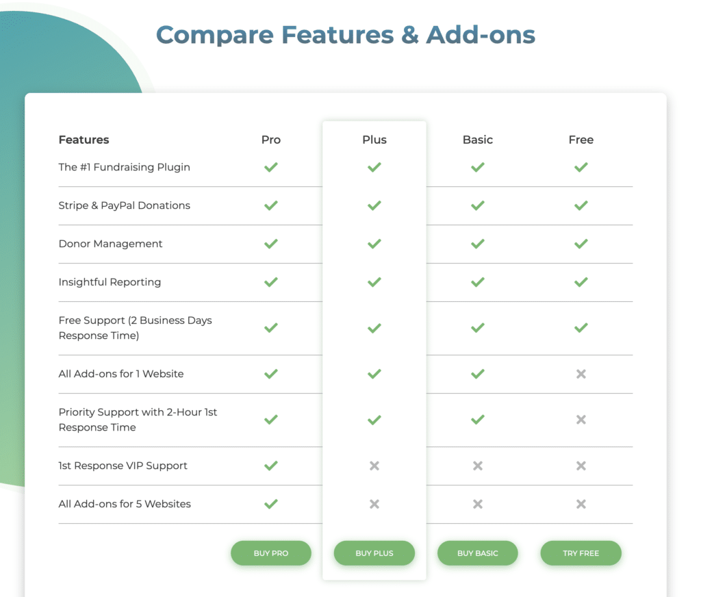
Back over to Malcare to see something else that they get right (that most people don't do) on their pricing comparison grids.
Before I show it to you, let me highlight what is the source of the issue. I think the issue comes from the fact that we're trying to solve different problems.
- The customers are trying to figure out which plan to choose.
- We're trying to justify the price of each of our plans.
As a result, we put a lot of content below each price, in the pricing grid. Even if it's the same feature across every plan.
You'll see that even Malcare does this a bit. They have items that are listed the same in every plan. But then they do the thing I recommend.
Check it out below the pricing grid….
If these features are in every plan, put them in their own section. Don't fill up your pricing grids because it makes it harder for your prospect to understand which plan is right for them. Pricing pages are there to drive conversions. So focus on that and make your grids easy.
These are easy fixes to drive conversions
If your product pricing page isn't converting, you should spend some time checking out Malcare, Gravity Forms, and GiveWP. It will likely help you see some of what I highlighted above.
But here's the good news – these are all easy fixes to drive conversions. So get after it!
Sign up for free content. People still do that.
Thousands of folks (7000+) regularly get my posts in their inbox. For free.