
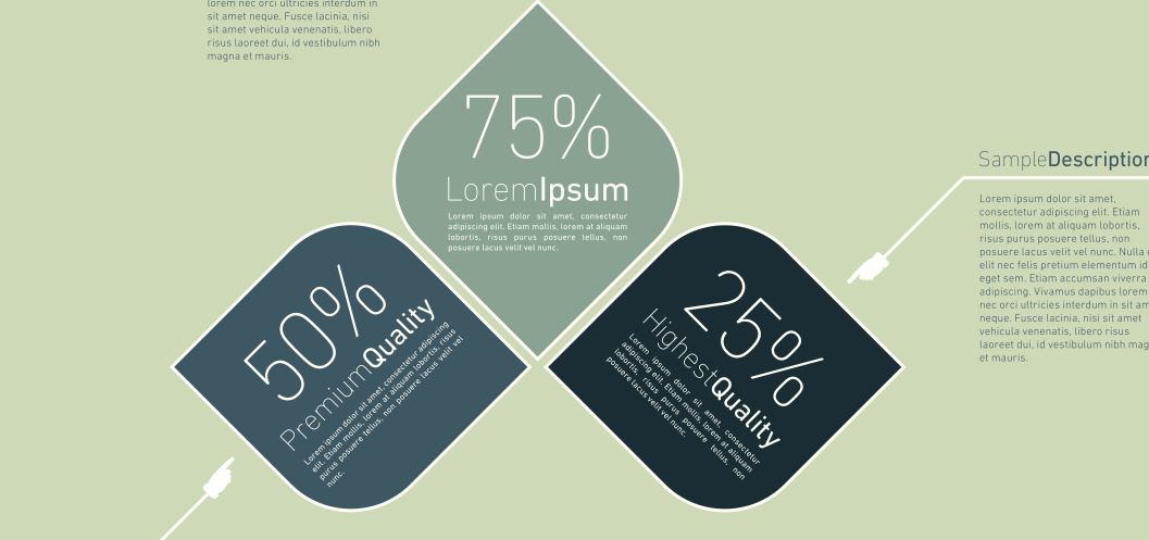
I love good infographics.
I am working on one right now to highlight the difference between Done and Done Done. I've written about infographic generators before and a decent amount of folks come to the web site looking for advice on infographics. In fact that article gets more traffic than any of my WordPress articles. Crazy, I know!
When I start to create an infographic, I go thru the same steps every time:
- Come up with my main point.
- Create the story that will be the narrative of the infographic.
- Pick a style and color palette.
- Decide if I'm going to design it myself in Illustrator or use a generator.
So I was at step four and decided to check out the regular four I watch normally.
That's when I saw the change.
Guess what? Piktochart announced a new version.
Normally new versions are better than the last ones. But that wasn't the case here.
 Two serious problems exist in the new version.
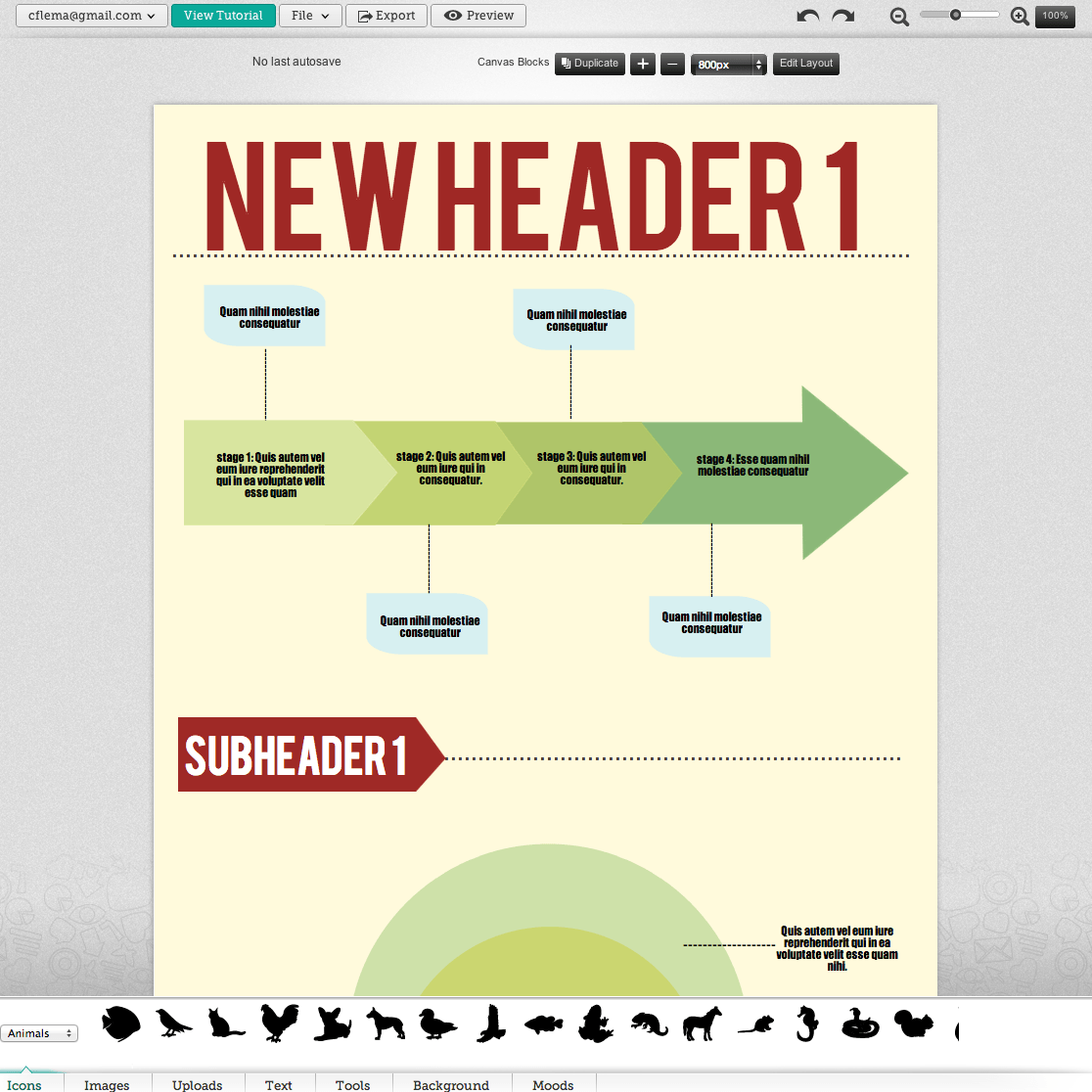
Problem One: The interface moved and changed.
I'm sure that the UI developer thought a bottom approach would work just as easily as the left sided approach they'd had in v.1 but it doesn't.
First, moving something for the sake of moving something is never helpful.
Unless you have a great reason to make a change, you shouldn't make it. Even a 10% improvement may not be worth it, if it means you'll confuse everyone.
Second, make sure the main thing is still the main thing.
The old interface started with color palettes. This one starts with image artifacts. They put the last thing you think about first, and the first thing you think about last. Bad call.
Problem Two: A tool for non-designers should solve design challenges
The whole point of using an infographic generator is because you don't know design. Right? And that likely means you don't know colors. Specifically, which ones go together.
And that's what moods used to do. But in the five different templates I looked at, the mood was empty.
What that means is that the main feature of telling you what colors went together on any given template was now completely missing.
That means it's time to look at the others or design each part myself. I think I'll just use Illustrator.
What are you going to do?