
If you haven't heard of website artificial intelligence, the concept is not hard to grasp. Instead of a designer or developer building your website, software creates it. And it does so by leveraging all sorts of logic rules and best practices. Some might argue that these logic rules and best practices are what help great designers and developers stand out from those who are mediocre.
To really appreciate this entire attempt at website development, you have to understand a bit about how websites are built today.
In many cases (not all), the layout of an article page is designed once—for all articles like it. This means that your experience isn't changed whether the article is 300 words or 3000 words. The content is on the right, and a sidebar is on the left. Or the other way around.
Again, in many cases (not all), the layout is designed with an eye towards content but sometimes the content doesn't arrive until later. So a set of “designs” or “layouts” are created based on how site owners think the content will work, but not actually based on the content because it hasn't even been created yet by the site owner.
Additionally, the look and feel—the colors, styles, font and more are all defined once, for the entire site.
The result is often an easy to navigate and consistent experience. But it can also lead to some strange non-optimized experiences when the content is overwhelmingly greater than the space, or dramatically less than what was imagined.
If you've ever landed on a page that has two paragraphs of text in the main content area and a sidebar of ads that runs three screenfuls long, you know what I'm talking about.
Website AI changes things
The idea is that the content itself—from the photos in an article, to the length and quantities of articles, etc—would shape (dynamically) the design and layout of the site.
Seriously, it's logical and brilliant.
Years ago I designed a user interface on a web application that would change the controls it used based on the quantity of data that it needed to share and users loved it.
So I could only imagine how awesome this would be when I first heard of the grid.io project.
Yesterday I finally got my hands on Grid.io
As you likely know, if you come here much, I use WordPress on a daily basis.
- I lead a group of software engineers who build WordPress applications
- I write about WordPress on my blog
- I use WordPress for that writing
- I coach WordPress product companies
So why would I spend a second on the grid.io project?
Because I'm a technologist and product strategist first, and a WordPress person second. So the idea of a full-blown website AI project was worth signing up for.
Has website artificial intelligence arrived?
The short answer for me is not yet.
Granted, I was testing the beta. But there were clearly some things that I really liked, and some things that I didn't yet fully grasp.
Let's jump into the good. These are things that I think are worthwhile, and that folks in web development (regardless of what CMS you use) should be considering.
Good: The user has limited decisions to make and they're driven by goals.
Take a look at the design aspects of the grid and how they let the user make decisions about how they want their site to work.
They focus on:
- Branding
- Color
- Layout
- Type
For branding, they let you decide how much the site should be driven by your choices and how much it should be driven by your content.
For color, they let you upload an image and then take it to create a palette for you.
On layout, you can decide what you're looking for—a minimal site with limited content, an editorial site with tons, an artistic design or more.
And you have font pairings already in place, where you simply decide on tone.
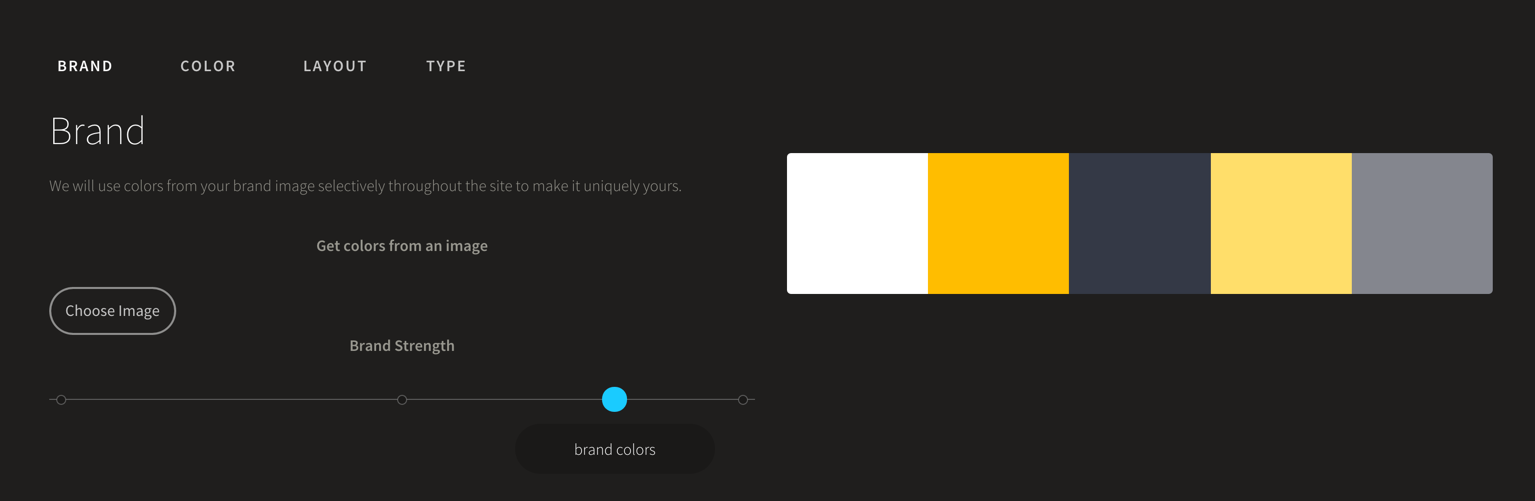
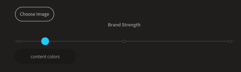
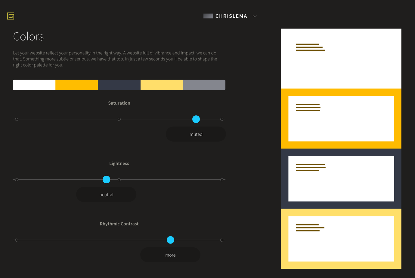
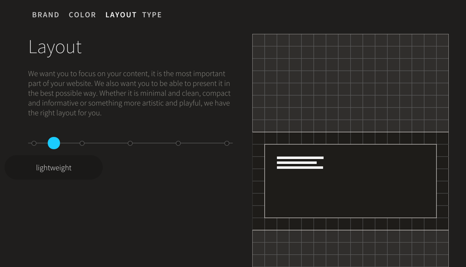
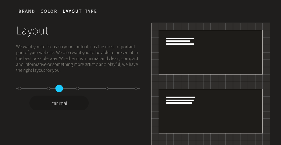

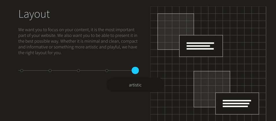

Pay particular attention to the blue dots and the labels they come with. Those are what guide the user.
In all honesty, it doesn't feel like the user can go wrong.
There won't be any wrong decisions—everything will look good or professional. This is a massive improvement to a lot of self-service solutions where end users can create their own design (resulting in MySpace).
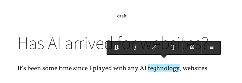
Good: The Writing Interface is Clean
We've all seen front-end editing and clean interfaces for writing, particularly with Medium. This is not very different.
Yet, it does strain the brain when it comes to what this would be like for non-blog websites.
- How or where might I put my business address?
- Where might I put a promotion or ad?
- How might I do anything more complex than a single column article?
Like I said, this is the beginning.
It strikes me that this solution right now is heavily focused on simple sites with lots of text or photos.
Bad: eCommerce isn't there yet
The website boasted that it would make eCommerce really easy. I was particularly excited to see and test those features. But from what I can tell, my beta version didn't have it activated yet. So, for now, I can't tell you about it.
What's interesting to me is that for the regular article publishing, you hit a button to publish and then you wait a bit for it to appear (this felt very much like the old TypePad days). If there's a lot going on just to publish a post, it makes me wonder how this eCommerce thing will scale.
Just a thought.
Bad: No feedback loops
Maybe the most frustrating thing about thegrid.io was that after all that great and cool stuff I got to do when setting up a site, writing a post, and publishing it, I had no way to give the system any feedback about the end result.
I wrote an article, which I subsequently published over to LinkedIn last night. I gave it an image.
When I published the post on thegrid, for some reason, the image wasn't available at all. Neither in the list of articles or in the article itself. And I had no way to give this feedback to the system. I don't mean opening a ticket. I mean, I had no way of saying, “This is a critical image that needs to be displayed,” or “This image should be above the article.”
When I noticed the coloring and font selection I had made, I wanted to change some things, but couldn't. Like the size of the title. Or the line spacing.
I know, in the world of AI, it should all look good. But what if I wanted it to look a tiny bit better (at least to me).
And this is why my answer is “not yet.”
At some point in elementary school, I decided I wanted to pick my own clothes to wear to school. My mom and I fought about this partially because I was strong-willed and independent and partially because I wanted to wear the same shirt to school almost every day.
What I wanted was to look exactly how I imagined I should look. Which was another way of saying, I wanted to look like other kids looked. I wasn't trying to create my own look. I was trying to fit in.
And for years this was a struggle because my parents were immigrants with no concept of how I should look or the consequences of wearing a lizard on my shirt instead of an alligator (or peach colored jeans).
But I'm not unique here (ok, maybe in the peach-colored jeans department). We all want our sites to both look good and look like other cool sites.
And the challenge with the AI approach to websites (beyond questions of SEO, performance, integration with other systems, etc) is that we lose control over things that are dear to us.
This is why my take, even though several things impressed me, is that we're still not yet there.