
This past week, WP Engine released a new version of their site. This post is about the lessons we can take (borrow, copy and steal) from the whole thing.
Let's get all the disclaimers out of the way first, so you can read the rest of this article without thinking this is just a big ad for a web hosting company.
- I host my site on WP Engine.
- I know many of their staff and consider them friends.
- I write posts on Torque, a WordPress magazine they fund.
- I am one of their affiliates.
If these truths annoy you or suggest to you that I can't write an impartial post about their recent rebrand and site overhaul, this would be the point where you take off.
I won't be upset. But what I have to share with you doesn't come from them. I've not spoken with their marketing or senior staff about the project. I never saw early comps. I've experienced it the same way everyone else has.
My observations however, match the lessons I've been sharing with companies (WordPress-oriented and non-WordPress ones) over the last couple of years. And the work they've done matches it so well, I thought it was time to share it with you.
First: If you're a tech company, don't take yourselves too seriously.
You're going to hear me say this many different times and ways in this post. But look at their typeface choice when you read “WP Engine” in their logo. It's casual. It's friendly. It doesn't take itself too seriously.
Why is this important? Well even if you're focusing on security (like they are), stuffy comes with a sense of distance.
What I mean by that is best explained by using an example.
Let's say you have two friends. One is the Vice President of a bank. The other is the manager at a laser tag joint. You have a question about business. Even though you don't think about it, wouldn't you rather feel more comfortable interrupting the laser tag manager?
Not because he has better business sense, but because it feels harder to interrupt a bank VP. Right?
The same thing happens when your image online suggests your too serious for people to interrupt you.
And for WP Engine, they want (and invest) in making it easy for you to engage them. They want to help. So it makes sense for them to define their brand as “approachable” even if they're doing serious work.
Now, to be clear, a brand isn't a typeface. I'm not suggesting you all go out and get the font they're using. It's not about the typeface.
It's about the choice they made to keep things approachable by not taking themselves too seriously.
Second: Computers aren't buying your services. Act like you know that.
We all know the value of mirroring, right?
If I sit in front of you at a table and we're talking and you're talking quietly, I want to do the same. Right? It connects us.
If you dress in “business casual” and I want to meet with you to talk about a potential deal, I shouldn't show up in shorts, right? I should match you.
The science is out there for you to read about, but if you're in sales, you know what I'm referencing here. We mirror the people we're connecting with, so that we have a better connection.
If we all know this, then let me ask you this: why do our web sites show images of our products instead of the people that buy them?
Most hosting companies have pictures of their server rooms – as if a server was looking at the site, got all excited and clicked the “buy” button. But servers don't shop. People do.
So humanize your site based on the fact that you know that the decision makers are human.
The number of large human faces, looking right out at me on their site, invites me to look back. The more I see people that look like me, the more likely I'm interested in being connected with that kind of company.
I know a lot of us don't like pictures of ourselves. But check out their about us page. You'll see real people, real employees, non-stock image, non-studio shots.
So unless you're building a site that sells to widgets, factories, web servers or other non-humans, take a second look at your site.
You've heard me say it over and over. Over 50% of our brains are wired to receive and process visual stimuli. Use photos to your advantage!
Third: At the right time, move on from clip art.
Now, my friends at WP Engine may not love me for saying this, but their old cog engine gear that was part of their logo looked like clip art.
I'm sure it was designed by someone, but it still felt like clip art. Not the same with their new mark. It's designed.
But notice that they didn't have a designer create a logo for them when they were just getting started.
I tell startups all the time to limit their expense on just about everything they can. This includes a huge budget on branding.
Don't get me wrong, I'm a huge proponent of getting clarity on your brand before doing anything.
But your logo isn't your brand. And you can go to market with a cheap logo just to get started.
I routinely send people (and I know others will hate this) to the 99designs logo store. I tell them to pick something for $100 bucks and run with it.
After all, many of them don't make it past 18 months. Do you really want them spending thousands on a logo before figuring out if they have a product or service they can really sell?
Like I said, I know others will disagree. But I'm a huge fan of getting started quickly and cheaply. As you get to the point where you know you'll be around for a while, and you're having success in the market, it's time to make a change.
Pay someone else – not your CEO and some friends, not a quick little fun in Adobe Illustrator – to do the hard work of creating a mark that fits with your overall brand.
In this case, WP Engine kept the idea of the cog, but it's more sophisticated. It's more elegant. But notice something else. It's simpler. There's actually less cog to this cog. It's the simplest cog you can get, while still being a cog.
To me it says simple. It says sophisticated. With the typeface combined it says approachable. And the cog itself says not only that it works, but works hard.
Again, I haven't spoken with their marketing team, so they might be cringing right now, if they read this. They could be thinking – “no, we wanted to communicate power” and then I'll just say I missed that.
But the point is, the spot they've taken, the corner of my brain they already have is simple, focused, sophisticated and hard-working, so why should it surprise me that their logo suggests the same.
Fourth: Make your re-launch a community effort.
Want to know the first thing I did when I saw a tweet saying their new site had launched?
Can I be honest with you?
I looked at every single page looking for my own quote. Because they'd asked me for one and I wanted to see if they used it. As I reviewed the site (and didn't find mine), I noticed just how many quotes they must have gotten.
They're throughout the site. Everyone. I would guess on every page, but I haven't done due diligence on that. But it feels like it.
It's the community speaking out to the rest of the world, telling WP Engine's story. Not just their marketing team. Nobody (sorry guys) wants to hear from them. They want to hear from clients.
And so their marketing team did two things – they got a lot of people to give quotes (which not only humanized their site, but gave it tons of credibility), but they also got those same people to check out the site (to look for their quotes) and tell others about the new re-launch.
Pure brilliance.
Please, do this. Copy them. Steal every single thing they did right. I know these guys, they won't mind.
The more your community talks for you, the less you have to say.
Fifth: Their brand promise is emotional.
Branding isn't easy. It's not something you do in a weekend. It's not a new logo, a change in colors, or downloading a new font. It's not even a tagline.
Branding is about a promise. An expectation that's set between a company and an audience.
And the very best promises aren't about features. They're not even about benefits.
Let me say that clearly – they're not even about benefits. Benefits are the results you attain from the experience. That's great. People love good benefits. It's much better to talk about benefits than features.
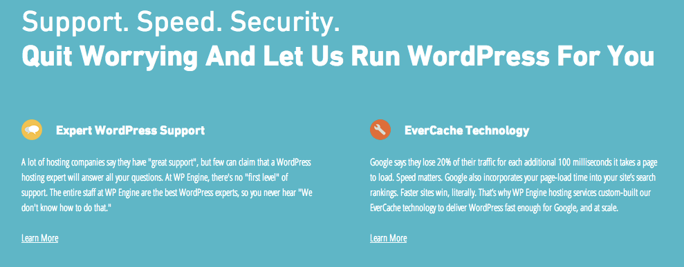
In the value chain, the feature is lowest. It's the thing you do or the service you deliver. WP Engine's home page has a tiny bit of feature on there (Evercache) that I would pull out. But hey, no one's perfect.
Then up the chain is the benefit. That's what you derive from the feature doing it's job. People like that a lot better than features. In the case of Evercache, the benefits are faster-loading sites, less lost traffic, and better search engine rankings. This is all great.
But there's one more stop on this value-chain. It's the emotional state of being I'm in after the benefits have been delivered to me.
Think about the last time you went to a great restaurant that was out of your budget. You either saved up for it, or someone took you (or you stepped into it by mistake). The food was so incredible. But after you leave, months later, are you remembering the taste? Or are you remembering how satisfied you were after you were done?
Their new site makes a promise: not about features. Not even about benefits. No, instead it's about your emotional state after moving to them.
They're promising peace of mind. That's an emotional state.
It's also the pinnacle (in my personal opinion) of the value chain when it comes to creating (and delivering) a brand promise.
Conclusion
So there you have it. If you're a student of the web, if you pay attention to sites and their re-launches, if you like thinking about branding, or if you're in the middle of doing a refresh yourselves – then do yourself a favor and go check out WP Engine.