October 5, 2012
Design without Coding: Comparing Drag and Drop WordPress Themes
WordPress is known for being easy. Drag and Drop WordPress themes are trying to make it even easier to design without coding. Here's a comparison.

If you want to check out plugins that are Page Builders which work on any theme you're using, check out this latest article.
The Holy Grail of WordPress Theme Design
The holy grail, it seems, of WordPress theme design is creating something so incredibly simple that just about anyone could use it, while also creating something that would allow a lot of creative expression. That's where the challenge lies - because making a theme that supports magazine, blog, portfolio, and corporate designs while also being simple enough that developers aren't required is tough work.
Drag and Drop
Regardless of how tough it is, tons of developers have set out to do that very thing. And a new cluster of theme designers has gravitated around a single concept to suggest how easy their themes are: "Drag & Drop."
Some have been doing this drag & drop thing for a while (iThemes, Headway & Pagelines), while others stepped into the space more recently (PressWorks & Ultimatum). Some theme designers have gone as far as to create plugins to do the work (Elegant Themes with their plugin Layout Builder).
Evaluation Candidates
So the goal of this review, was to evaluate several of these themes to see which offers the right mix of ease of use with creative expression. The list of themes tested included:
- Builder by iThemes
- CarringtonBuild by CrowdFavorite
- Headway
- Pagelines
- Presswork - No longer active
- Ultimatum
Additionally, while multiple themeforest plugins promise drag & drop, I was unwilling to buy and install them - so I only tested a single plugin from a source I trust - ElegantBuilder from Elegant Themes.
Why I didn't count Pricing in the Criteria
Since the promise of these themes is that regular non-developers can use these themes without coding, I would submit that the price tag for each of these themes is worth it (assuming it can deliver on its promise).
Additionally, I own licenses for each of these themes and plugin. So I didn't have to face that issue in my own ability to test them.
My Definition of Drag and Drop
Before I started my evaluation, I had a definition of drag and drop. It went something like this:
The end user can assemble the design of a web page by dragging and dropping key elements/components onto a "canvas" designing the layout/structure of the page.
What you will notice is that each vendor thinks of drag and drop differently. In many cases, what they mean is that drag and drop will be the mechanism to adjust sort order of components. In cases where that was true, you'll notice I mention it's not very drag & drop. I'm sure vendors will disagree with me. But my evaluation was based on the definition I started with (rather than adjusting my expectations to match their definitions or marketing).
The Test Case for the Evaluation
I had no question that each of the themes would do something and be useful in some context - like blog sites. But my bar went beyond creating a blog layout because the point of these drag & drop themes, in my mind, was to be able to let a regular end-user design a site that they might normally pay for (where designers would use CSS to lay things out, etc).
So the image below depicts what I had set out to create with each theme. As you can see, I didn't spend time on the details of the design. Instead, my key focus was layout and structure. Could a drag & drop theme deliver, with ease, a way for me to create this kind of page layout.
The Evaluation Criteria
In reviewing each of the six themes and one plugin while trying to create the layout defined above, I was evaluating several things:
- Could it create anything other than a blog layout?
- Were there components I could drag and drop to create different designs?
- How many different kinds of components were available to me, did they allow for the kind of expression I was looking for, and were they easy to understand?
- Could I get going on my design without a manual?
- Were the drag and drop designs tightly linked to the page it was for or could I create designs that I could use for multiple pages?
- Did these themes take into account responsive design or mobile visitors?
- How close could I get to my target design/layout?
Evaluating PressWork
The first theme I tested out was PressWork and I'm glad it was my first. It was, without question, the most limited of the group I evaluated. But let's be clear, that doesn't make it bad.
Think of it as in sixth place at the Olympics in the 100m. Sure they're slow, but they'd beat me (and likely you) every day of the week.
It's a theme that works well for blogs, as that's its goal. It doesn't attempt to let you create more complicated layouts but that helps it stay simple. The tools they give are simple to use.
The user is given a simple screen (when they click on the layout icon) to add components to the screen (no dragging or dropping there). Then, users can move those items (logos, widget areas, etc) around the screen into fixed areas on the page (the header area, the content area, and the sidebar area). At that point, it's truly drag and drop.
Anyone can get started with PressWork without a manual - which is great news.
One thing that was a bit odd to me was their exposure of hooks (actions and filters) because it didn't seem like it matched their target audience. But I'm glad they're there if I ever need them.
Nothing suggested responsive support and since I couldn't create my target layout, I pretty quickly moved on.
UPDATE: Pressworks has shut down and the theme isn't supported any longer.
Evaluating CarringtonBuild (in the FaveBusiness Theme)
When I started asking folks what drag & drop themes they knew of, this one didn't make the list. I think that's because it's a feature hidden in some of CrowdFavorite's themes - like FaveBusiness. But if you don't know about, you should - it's pretty nice.
When you start with FaveBusiness and click on the theme settings, you'll notice that you don't see much there. It doesn't overwhelm you with tons of options (like Pagelines does). But because I'd seen the 2 minute video on their site, I knew that their designer was found when creating or editing a page/post.
Clicking on the "Build" tab, let's you add rows to your design. These rows can then hold components - and without a doubt, CarringtonBuild had the second-largest list of available components out there (Ultimatum won that content).
One of my issues with some of these components was that it wasn't exactly clear what they'd do. In most cases, there was a description, but when something is called "Hero" and the description is "superimage" I'm still at a loss for what it will mean when I add it to my site.
That said, the amount of drag and drop was pretty low (and would highlight the bar that most vendors set - which wasn't really drag and drop, by my definition).
CarringtonBuild didn't let you create widget areas, which was a bummer for me, since I had imagined that I might use that approach to design the page. In most cases, their "shortcode" component would do the same thing, so it wasn't that big a deal. But I did miss it.
Another issue I had was that I couldn't find an easy way to define a layout and then re-use it on another page. That was a bummer for me because it suggested that I would have to go and do this set up all over again on the next page where I wanted this look.
While nothing suggested responsiveness, you did have the ability to attach a custom CSS class to everything, which would let someone else go in there and do that. But not the target end-user of a drag & drop theme.
As you can see from the image below, I was able to design the page I wanted without too much hassle. But I'd have to use my own slider...because that wasn't one of the components available.
Evaluating Ultimatum
To say I was impressed with Ultimatum would be an understatement. Unlike CarringtonBuild, you actually do drag & drop the components onto the areas of the screen you want them in. True Drag & Drop. But you can't put them just anywhere (so it's not perfect). You first need to create rows (and define the row break up by percentage). This creates the spots you can drag items into. But it's still drag & drop.

One place where it excelled was in the list of available design elements. When you go to create a layout, the elements on the right side seem to go on forever. And they're names are super-clear (unlike CarringtonBuild or Pagelines).
The elements include custom loops, social icons, sidebars, menus, logos, images, included pages, recent post lists, and even slideshows. It beat everyone hands down when it came to design components you could use to create your layout.
Additionally, their layouts are abstracted. By that I mean they aren't tied to single page (like CarringtonBuild). So once I design a layout, I can use it on multiple pages. Selecting it is as easy as picking the layout from a drop down on any post or page.
Another place they excelled was in their support for mobile and responsive designs. They not only support responsive designs but they even let you use fitvids for responsive video layouts.
I had no trouble creating my target design using Ultimatum.

They have just rolled out a new version - eagerly awaited by many. You can read about the details in my latest review.
Evaluating LayoutBuilder by Elegant Themes
Having gotten half way thru the list, with two themes that were able to create my design, I was ready for a break and a move to check out the plugin by Elegant Themes.
I activated TwentyEleven and then the plugin.
Right away I noticed it was tightly coupled with the post or page. Even though there seemed to be a notion of saved layouts, there was no easy way to see how I might save my existing layout.
Additionally, while the plugin may have an interest in responsive designs and mobile users, the only thing it supports that's remotely responsive is a "re-sizable column." This seemed to work fine with text but it was unclear that it would work on photos or anything else.
Another way this plugin was like CarringtonBuild was that there were multiple content types but it was unclear what they actually did. Unlike CarringtonBuild, this list of components didn't even have a description.
That said, you do get some drag and drop, so that was good news.
And as you can see, I was able to create most of my design. Unfortunately, it didn't let me manage the header or footer, so it's not a perfect solution.
Evaluating Builder by iThemes
I must admit that I went into the test thinking Builder would win it. Why? Because almost two years ago, when I was working a lot with Builder, few other themes were able to let me design any kind of layout and apply it to any page - using widgets.
~~With all the competition though, Builder struggled to stay towards the top. I've read all the posts on the iThemes forums, so I know the path to responsiveness will be difficult, but clearly Builder took a big hit from not being responsive. What does that mean to you? Well, honestly, if you aren't seeing any traffic from mobile, then maybe you might score Builder higher than I did. But if you're not seeing ANY traffic from mobile, what are you doing over there? I want to know.~~
UPDATE: Builder 4.0 supports responsive design. And the iThemes folks just released their Style Manager for 4.0 as well.
What I like most about Builder is that their layout designer is separate from the pages that use them. It goes to the heart of the re-use I was talking about earlier. While I may not use my target homepage design again, I will surely use different kinds of layouts more than once and I don't want to have to re-do that work.
Drag & Drop exist but only nominally, like some of the other themes, where it's used for sort order. The rest of the time, you're adding components with a click, and then configuring them.
What's different about Builder is that its components aren't content-oriented components. Instead, they're structural components (header, footer, content, image, navigation, etc). This has its pros and cons, depending on what you're trying to do.
It also means if you're not a programmer, you can design the layout easily with lots of widget areas, like I did, but you'll still need some plugins to give you the features you want in those spots.
Thankfully, iThemes has several plugins (loopBuddy, displayBuddy) that might help you.
All in all, it was really easy to use and I had no trouble creating my layout - using a lot of widget spaces.
Evaluating Headway
Just like I came into the evaluation with certain positive biases about Builder, I came in a bit negative about Headway. I'd bought and tried to use the theme a while back (maybe two years) and really struggled to figure out how to do just about anything quickly. But since I owned the license and since they'd come out with a recent upgrade, I put it on the list and knew I wouldn't quit until I figured it out.
Nothing prepared me for how simple and easy it was going to be. I remembered a different interface that had been a pain. The new interface (while still all black) was much easier to understand.
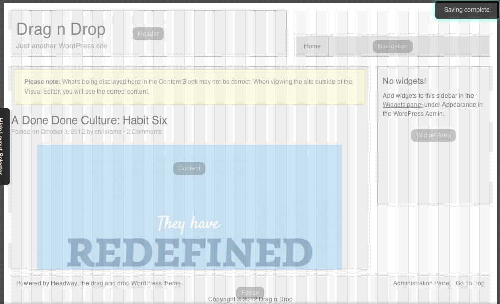
It allowed me to truly design the page I wanted - by drawing on the canvas. I wasn't dragging or dropping - I was simply drawing. And what was even better, I could see my content below my design, to see how it was taking shape.
I was able to create a new layout, name it, and add blocks with various widths and heights. All of these were widget areas, just like Builder, only this time I wasn't on a screen far from my content. I didn't have to guess how it would look. I could see it directly.

Each component I put on the page is configurable via the edit panels at the bottom of the screen. These allow me to adjust what is displayed (like in the content's meta area) as well as how (font, size, color, etc).
Not tons of drag and drop, but clearly in line with the hope of what end-users want, when they want to design a page to match what's in their heads.
They also support, in this recent version, a full and complete approach to responsiveness, which made me (and all mobile phone users) happy.
In the end, design my page was no trouble at all.

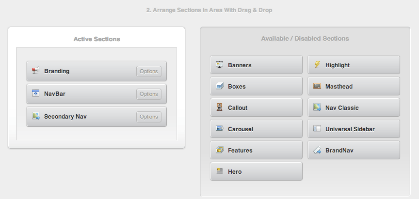
Evaluating Pagelines
This is the older version of their drag and drop interface. Look for a new review soon.
Unfortunately, it's that "lot of stuff" that really killed its score in this evaluation. There was no way I could score it anywhere near close to "easy to use".
While it has a large amount of components that can display text, there's virtually no way for anyone to know which one to use, when, or why. There is no way to know what they mean, or how they will work - especially without a manual or watching hours of videos.
So even though it's completely mobile and responsive friendly, those high scores get clobbered when looking at ease of use, or the ability to re-purpose designs.
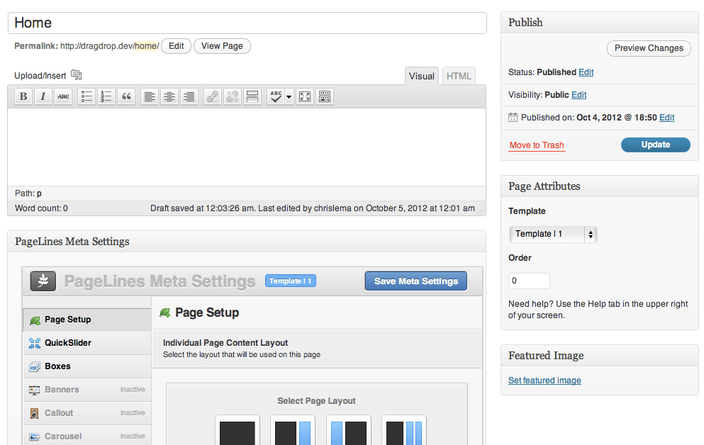
Part of that re-purposing challenge comes from the flexibility they've created. You can create 5 different templates - that's great news. But the details of those templates are lived out in the pages themselves via an elaborate set of meta boxes you have to configure on the page edit screen.
This makes it really hard to re-use the design itself (though their approach to boxes, call-outs, and other custom post types does let you re-purpose the content easily).
Probably the biggest challenge Pagelines faces is that the end user has no idea what they're designing as they're designing it. The page design is broken up into so many pieces, and across so many different screens, with so many different options, that you can't keep the image straight in your head.
So unless you have a PhD in abstract design, Pagelines isn't for the end user who is trying to design a site without an engineer.
That said, it's well worth learning the Pagelines framework, if you're a developer, because there are a ton of things you can do with it.
Scoring the Drag and Drop WordPress Themes
UPDATE: The scoring has been updated (to take into account Builder's updates).
The 7 criteria below determined the ranking of the themes.
- Could it create anything other than a blog layout?
- Were there components I could drag and drop to create different designs?
- How many different kinds of components were available to me, did they allow for the kind of expression I was looking for, and were they easy to understand?
- Could I get going on my design without a manual?
- Were the drag and drop designs tightly linked to the page it was for or could I create designs that I could use for multiple pages?
- Did these themes take into account responsive design or mobile visitors?
- How close could I get to my target design/layout?
I scored each one a 1,2, or 3 based on how well they did for each criteria and you can see the results.

And the Winner is...
Of course the winner is whoever you decide it is because it's based on what you care about.
Ultimatum beat Builder and Headway by a single point. All three are excellent choices and really depend on what kind of site you're trying to create. But in either case, you won't need to write any code to get a pretty nice design in place with a few clicks and drags.
A story. An insight. A bite-sized way to help.
Get every article directly in your inbox every other day.
I won't send you spam. And I won't sell your name. Unsubscribe at any time.
About the Author
Chris Lema has spent twenty-five years in tech leadership, product development, and coaching. He builds AI-powered tools that help experts package what they know, build authority, and create programs people pay for. He writes about AI, leadership, and motivation.