July 14, 2014
A Tale of Two Customizers: helping users customize WordPress
If you're building a product that will allow users to customize WordPress, take a lesson from these two examples.
"It was the best of times, it was the worst of times, it was the age of wisdom, it was the age of foolishness..."
That's how Charles Dickens opens his novel, A Tale of Two Cities. It's also how I decided to start this post - because what I want to do today is show you two very different approaches to letting users customize WordPress sites.
Customizing WordPress
You remember the age of custom control panels inside of themes (and then plugins) where users were given tabs to control hundreds of options, right?
It was like the first time a Visual Basic programmer learned to use the Tab control. Suddenly, there were tabs in every application and on every screen.
The same was true for a good long period of our WordPress experience - particularly when dealing with themes. What's worse was that every theme was different.
Introducing the Customizer Panel
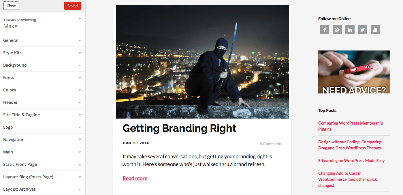
What you notice on the left side of the screen is the WordPress Theme Customizer. It's a powerful solution that was first introduced in version 3.4 but has really taken off recently. And we'll see it used more in the upcoming 4.0 release.
The theme customizer allows sections and in it, various controls that you can adjust. It also offers a way to see those changes in real or near real time as you update things in the panel.
This is what we might call the "new" or "right" way to think about offering customers a chance to customize their WordPress site.
But wait. Is there really a "right" way?
Any time I use the word "right" I freak out a bit. Because I normally like saying "it depends." :)
But in this case, I'm not making a case for its use because it's better, nicer or easier. Instead, I'm simply making the case for the following three reasons.
It's in core. The WordPress project has determined this is the way they want to go about things. That's reason enough to embrace it.
There's natural feedback. The end user may not know what something does, but you can easily see how they'd learn quickly - because right after changing something, they see it change on the screen in front of them. They don't need to go anywhere else. They don't need to preview anything else. It's right there.
Everyone's doing it. Almost. While this may feel like the most tenuous of arguments, the reality is that as more developers embrace this approach, the learning curve for end users drops. They get used to this approach and expect it everywhere.
That's why it's a better or "right" approach.
Is there a wrong way?
You might wonder. If I'm telling you there's a right way, is there also a wrong way. I think so.
In the video above, you'll notice as I walk thru two themes that work differently, Make (by the Theme Foundry) and Pagelines.
The first fully uses the theme customizer. The second creates their own metaphor - one that I think is complicated, complex, and inconsistent. The result is that I don't think you need training with Make, and I do think you need a lot of training with Pagelines.
But the Customizer is only for Themes...
I know - you're likely to tell me that the theme customizer doesn't yet work for plugins - so you're out of luck.
But that's why I showed you Optin Monster in my video. They created a screen that worked like, and looked like, the customizer - even before there was real support for plugins in it.
That's forward thinking because it streamlines learning and the user experience and preps people for a time when they'll switch.
So there you have it. Follow the folks behind Make and Optin Monster.
If you watch the video, you'll see their two customizers compared to the other and likely agree: it was the best of times, it was the worst of times.
A story. An insight. A bite-sized way to help.
Get every article directly in your inbox every other day.
I won't send you spam. And I won't sell your name. Unsubscribe at any time.
About the Author
Chris Lema has spent twenty-five years in tech leadership, product development, and coaching. He builds AI-powered tools that help experts package what they know, build authority, and create programs people pay for. He writes about AI, leadership, and motivation.