June 22, 2017
Misunderstanding the goal of the Gutenberg Experience
I checked out the Gutenberg plugin and new writing experience for WordPress - via an early plugin version. It's clear I missed the goal of this thing. I tried the new Gutenberg writing experience for WordPress today! Having read all the early reviews of the new Gutenberg plugin (which is still a very early release),...
I checked out the Gutenberg plugin and new writing experience for WordPress - via an early plugin version. It's clear I missed the goal of this thing.
I tried the new Gutenberg writing experience for WordPress today!
Having read all the early reviews of the new Gutenberg plugin (which is still a very early release), and then reading the interview that Matt Mullenweg did with Torque at WordCamp Europe, I was excited to try it out.
What I read from Matt's interview, which matched his WordCamp US talk last December, was that this focus on the editor experience would let us leapfrog the experiences that newbies were enjoying with Wix, Weebly & Squarespace.
Of course, there's always mention of the nice writing experience of Medium that is always mentioned, but the target, that I thought I heard, was the other players. The folks that were spending gobs of marketing money on ads and were taking market share from the WordPress ecosystem.
It's clear I've misunderstood something, but first...
Before I tell you about my experience, let me set the record straight on several things.
I believe that the number of volunteers working on this have done a great job. They have put in tons of hours and have essentially started re-wiring the admin interface for publishing. That's a big deal. And it was going to be a ton of work no matter what the end user experience ended up being. So I totally appreciate their hard work.
The plugin is still in a very early state. While we talk about how fast things have moved, it's important to know that this is still really early in the process. So things may change. And you have to know that going in and checking something out that early in the lifecycle of a product.
I read no documentation and watched no videos, so there's a good chance that I missed a lot of things. Human user error is easy when you haven't prepped what you're about to do. And that's even more of an issue when you go in with pre-conceived ideas of what you'll be able to do, and how you'll be able to work.
But with all that said, I left the experience feeling like I may have missed the main objectives - and not by a little, but by a whole lot....
Are we competing with Medium or Squarespace? Have we decided?
First Efforts
When I started, I installed the plugin. I then went back to the home page, because I just assumed I could create a new page from there and I would be dropped into the editor mode.
That's not what happened. I ended up creating a new page (in the admin area). Then I looked at the list of pages, and saw a new link, "gutenberg" and clicked it.
I then moved to editing that, but internally. I wasn't editing on the final page or presentation layer. I was editing internally.
Was it nice? Yes. Was it easy? Sure. Did it feel like it could easily compete with Medium? Sure.
But was that the point?
I thought we were trying to let folks create posts, pages and websites that were row & block based. Instead what I saw was an internal interface that was abstracted from the reality of the published page I was creating, and mostly I was getting Medium features.
In short, if we are competing with Medium, I think we're on track.
Though I will say, after I published the post, I couldn't figure out how to get back into Gutenberg mode to edit that page. I went back to the page listings and clicked the "gutenberg" link, but that dropped me into that page with a blank interface.
I lost all my earlier writing. So I had to click "back" a few times in the browser and then click save again to get the content back.
So it's not a perfect Medium experience. But it's nice, and I can see how someone might like it.
But who is our target?
Didn't we want to tell the world that WordPress was more than just for bloggers? If by "rich content" we mean mostly blogs with nice pictures, then this is it. We've figured stuff out.
But I thought that WordPress does more than just blogs? And if we're going after something different, like pages and sites, then we're far away from the things that Wix, Weebly & Squarespace are advertising.
We heard that we needed marketing councils, and now we're collecting marketing case studies, but if our focus is on the Medium-style editor, we're going to walk into a gun fight with a knife.
The problem we should be solving
If we're going to solve a problem with this plugin, shouldn't it be the cognitive dissonance that people have when they edit in one interface and see their work product appear in a different interface that doesn't look like they thought it would?
What do we want? On page, what-you-see-is-what-you-get (WYSIWYG), content creation. When do we want it? Now.
Look at what things looked like as I was creating content.
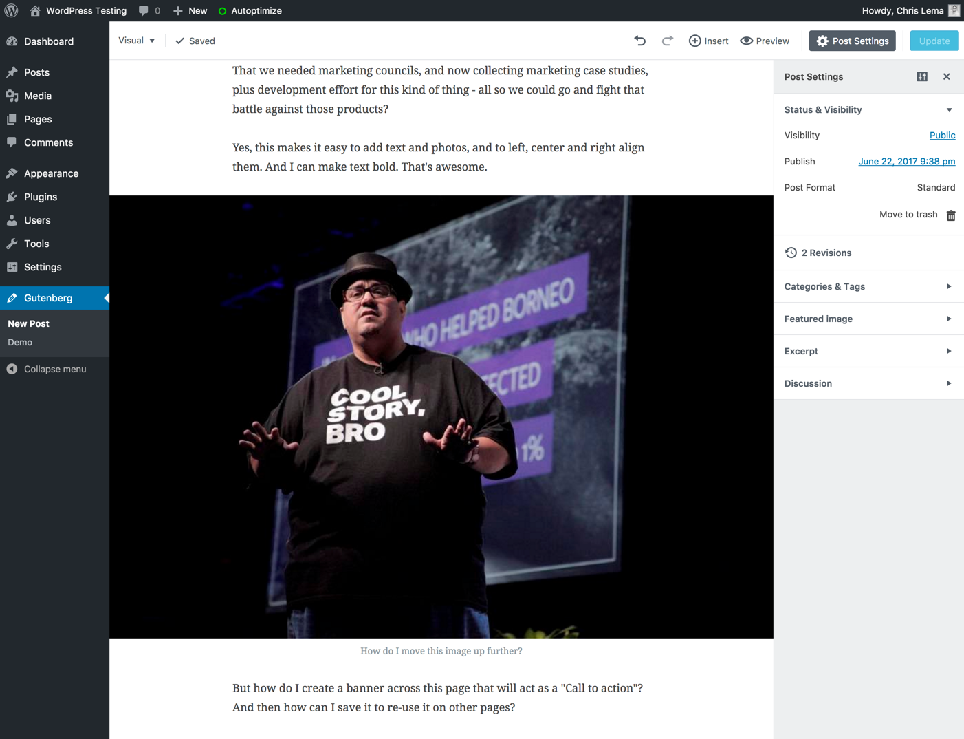
When I added the photo, I made it span the width of the space I was typing in. Cool. I like that look.
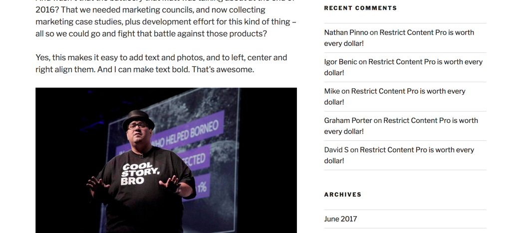
But when I went to see the published post, I saw something different.
That's a different look, isn't it. Not spanning the whole page. But it did span the entire content area. That was nice.
Then I changed the theme. And as you would expect, things changed.
This time the image was constrained by the column for content. The sidebar made it much smaller.
What's my point? Don't I know that the theme does that? Not a plugin?
Yes I do. But my mom doesn't.
And with Squarespace or Wix or Weebly, she doesn't have to understand the difference between a plugin and a theme. Or which one controls what. Or why the internal editor made things look one way and the outside expression looked differently.
It's clear I misunderstood the goal
It was clear, just an hour into the exercise that I was the one in error. After reading how happy Matt was with where things were, after reading a lot of glowing reviews, it was clear that what I thought the goal was, and what it really was, were different.
Yes, gutenberg is the future of a completely different interface for editing. Goal met. And it works in content blocks. Got it.
But you don't get control over how that content is presented. That's still the theme. The quote component that I dropped into my fake article was in the "formatting" block area, but I couldn't format it almost at all. I couldn't put a line on the left side or indent it to only be half the width of my content column, or have it expand past it.
Instead I could just add a pull quote and then click publish and see what the theme did to it.
Not all that different from what happens today, for me or my mom.
I'm ok missing the boat on this one. I like that the editor is getting a facelift.
But will I be recommending this for anyone who isn't just a blogger who wants to write on an interface more like Medium? Not yet.
I'll keep sending them to Beaver Builder, who has nothing to worry about, except for all the things that Wix, Weebly and Squarespace are doing. They need to keep focused there, because like Matt said, those are the guys to beat.
Note:
The folks that are working on this plugin need feedback. So if you're a developer - download the latest plugin and give them feedback. I stopped being a developer a long time ago. So what I could do isn't as useful as what you can do.
You should download it, check it out, see how it works with your other plugins and send them back notes. They're actively doing things on github and I'm sure they'll welcome your feedback.
When it's all done and pushed into core, because this is the future of WordPress, I'll be sure to circle back and see how I can help tell the story of this feature.
To that end, I've closed comments here. They need your comments over here.
A story. An insight. A bite-sized way to help.
Get every article directly in your inbox every other day.
I won't send you spam. And I won't sell your name. Unsubscribe at any time.
About the Author
Chris Lema has spent twenty-five years in tech leadership, product development, and coaching. He builds AI-powered tools that help experts package what they know, build authority, and create programs people pay for. He writes about AI, leadership, and motivation.