You know I never like to suggest that there's a wrong way to do anything. But in some cases, you just have to be honest.
So I'm going to say it. Plugin developers – particularly WordPress plugin developers – there's a right way and a wrong way to create that plugin you're working on.
I'm specifically talking about the user experience here.
But before I get to that, let me help you see it more clearly by making another broad generalization.
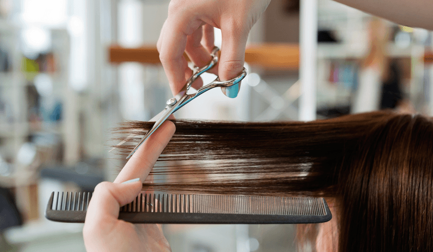
There's a right and wrong way to give someone a haircut.
Yup, I've now gone and frustrated two sets of people:
- Happy haircutters
- Happy plugin devs
But it must be said.
I used to cut hair when I was in college
I'm not talking about salon hair cutting. I was no trained professional.
But several people would come over to our apartment one weekend every month or two, and I would do four or five hair cuts.
I thought I was pretty good.
Until.
See, here's the thing. And I know you already know this.
The right haircut is the one that works for your head/face. The wrong haircut is the one you know how to do that you apply to any and everyone.
See what I mean?
Now you're nodding your head. You agree with me, right? There's a right way and a wrong way.
So let's talk about WordPress plugins
Before I get into the user experience thing with plugins, can I ask you a question?
What's the most important innovation in user experience you currently take for granted?
If you're like me, the answer is WYSIWYG.
You have to be old like me to remember the days when there weren't fonts on the screen, or you couldn't tell what it would look like until you printed something.
Then, suddenly, there was WYSIWYG.
It's a promise that these days no one thinks about. But to me, it's critical – because it removes the cognitive dissonance, the friction, in the human-computer relationship.
And that's what I'm talking about when it comes to plugins.
Cognitive dissonance and friction still exists.
How you design your screens and what you output matters
I can't tell you how frustrating it is to write a post where I think my subtitle is the perfect size in my WYSIWYG (not really) editor, only to press preview / publish and discover it's wrapping on my public site.
I can't tell you how frustrating it is to create a form and click it's preview button, only to discover that when it's placed on my own site, it doesn't look that way.
Oh, I'm sure you can tell me the various ways (people already have) that I can get my own styles to be leveraged in my editor. But honestly, telling me what I have to do to change how the software works, only highlights that we still have the friction.
And it's a friction that most people pass on to the end user.
But like I've taught my development staff for twenty years – we are paid to solve the tough problems. Not just the simple ones. And we don't just pass on the friction and tell others how they can solve it.
How you design your screens and what you output matters. Because it suggests to people that things are easy or hard.
One interesting study years ago discovered that there was a high correlation between people's inference on how easy something was to do/use, and how easy it was to read.
A single font choice was the difference between people thinking, “I can do that” and people thinking, “that's too hard.”
A font choice!
Why am I going on about this?
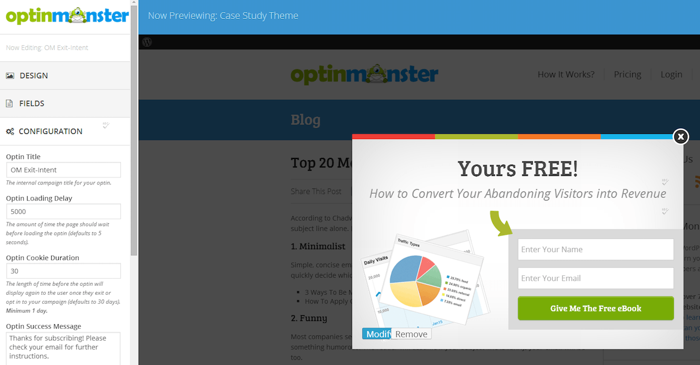
One of my favorite plugins is called Optin Monster.
But it had a problem. I would design my form using their designer, and then when it was published on my site, it looked different.
I'm not saying I went into “hulk smash” mode, but I was close.
So you can imagine my delight when I read these words on their changelog:
- Completely redesigned interface for creating and managing optins!
- Completely revamped live preview interface with sensible defaults for all new optin campaigns.
- Dramatically improved interfaces for creating new optins.
It was the first three lines in their update notice about their new version – 2.0.
They circled back and removed all the cognitive dissonance. The friction is gone.
This is the right way!
Like I said, I hate saying there's a wrong way to anything. But it's clear that this approach – where what you see really is what you get – helps people more quickly and easily do what they want to do. Without fear. Without stress.
And that's most certainly the right way.
It's why I recommend more than just users check out Optin Monster.
Developers should check this out too, to learn from the way these guys have coded this up.
Oh, and by the way, if you want to know the right way to cut hair, based on the shape of someone's face, you can get that too (just not at Optin Monster's site).